UX & UI DESIGN 

August 2021
User Research
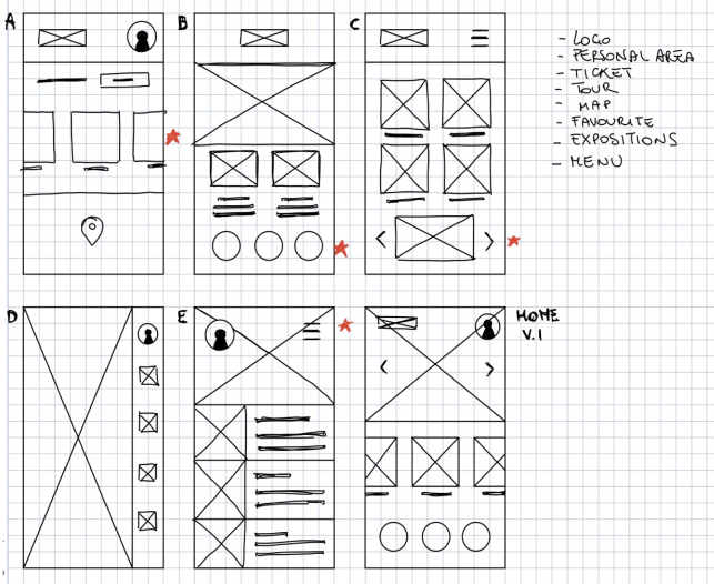
Wireframing
Prototyping
UX Design Professional
by Google
The goal was to design an application that would satisfy
the needs of users of different ages and with different usage interests.
I interviewed 66 people. I have looked for people with different age, location, education and
job.
The goal was to have as broad a vision as possible about the set of problems during a visit in a
museum.
On some aspects the answers were similar for all, on others the interests were different.
I, therefore, identified two personas who could represent the majority.
The goal is to have all the features easily accessible in one place. This facilitates the process of entering the museum and the visit itinerary.
From the homepage you can easily access all the features of the app.
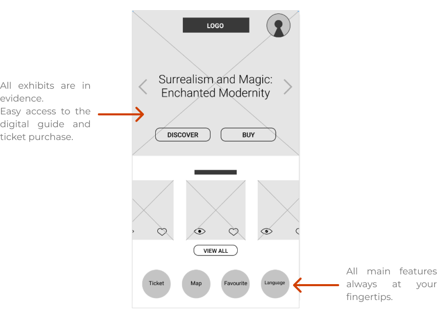
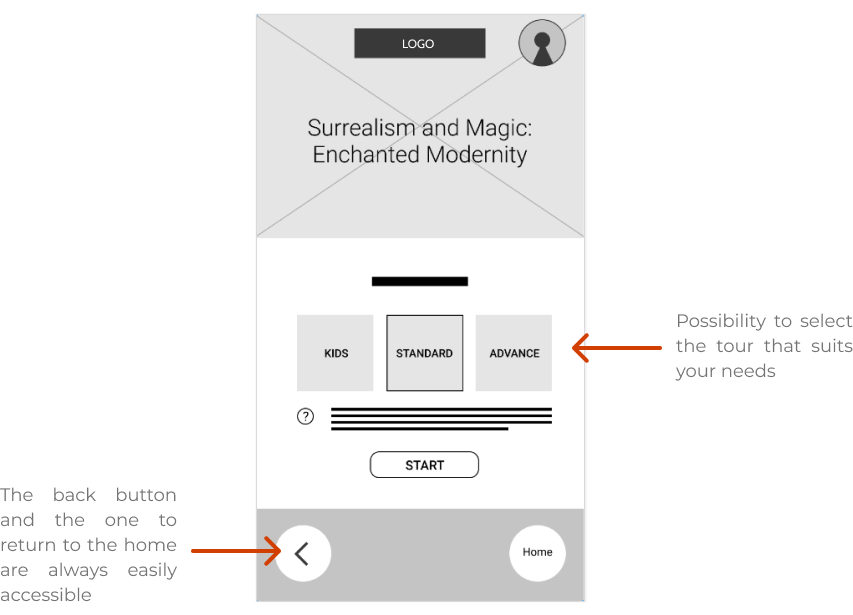
After purchasing the ticket, you can access the digital guide directly from the app and
choose the most suitable route for you.
Unmoderated usability study
Remote
6 people of different genders and 1 with a disability have been selected randomly
Each session
lasted 30 minutes.
I conducted two rounds of usability studies. Findings from the first study helped guide the designs from wireframes to mockups. The second study used a high-fidelity prototype and revealed what aspect of the mockups needed refining.
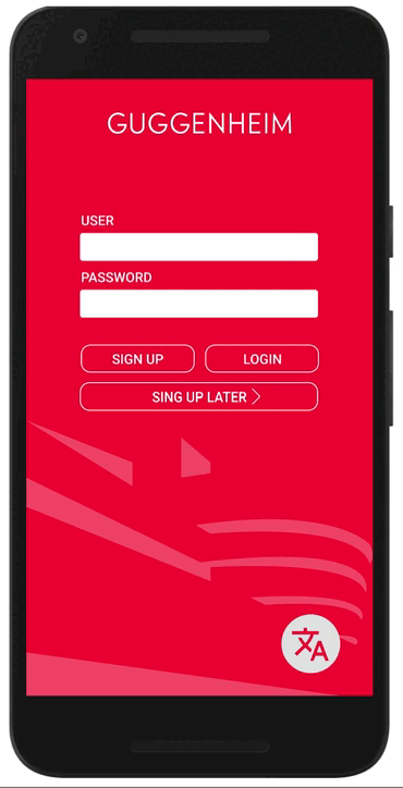
Users want to log in as a guest to try the app before signing up.
Users would like to find their favorite works more easily.
Users want to be able to stop and listen to what the guide said.
The colors made little contrast.
More attention was needed to people with disabilities.
The application maintains consistency in color, style and function keys across all pages. The only ones that differ are digital guide and map. Having augmented reality functionality, I wanted the detachment to be evident.