PACKAGING 
knowledge and care of its territory. Flumere is the product
line of local wines they have decided to launch on the market.

August 2018
Graphic Designer
Zuane Srl
I was looking for a clean and elegant design but not pretentious for this project. The wines of this area have an unexpected and particular flavor, but with a humble origin. Even the price of this type of wine is usually low, even if the level is very high. For these reasons, I tried to include all these aspects in the design to present the product in the most honest and truthful way possible.
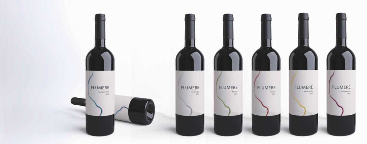
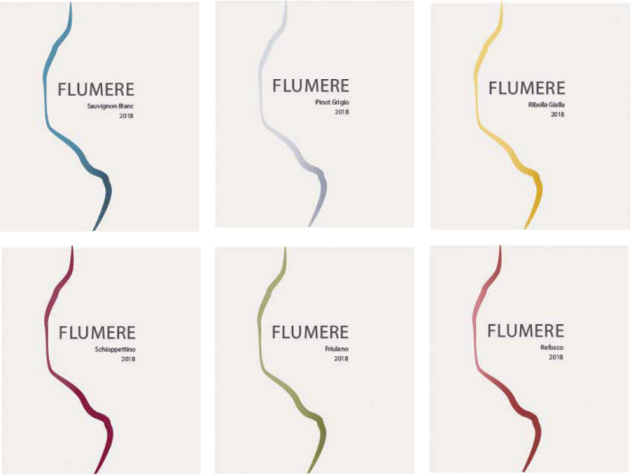
The name means “stream” in the ancient language of this place. A small stream runs right next to the estate of the winery. Streams are an important element both for the history of the territory and for the land used for cultivation. It is thanks to the richness of substances in the soil that these wines are so special.
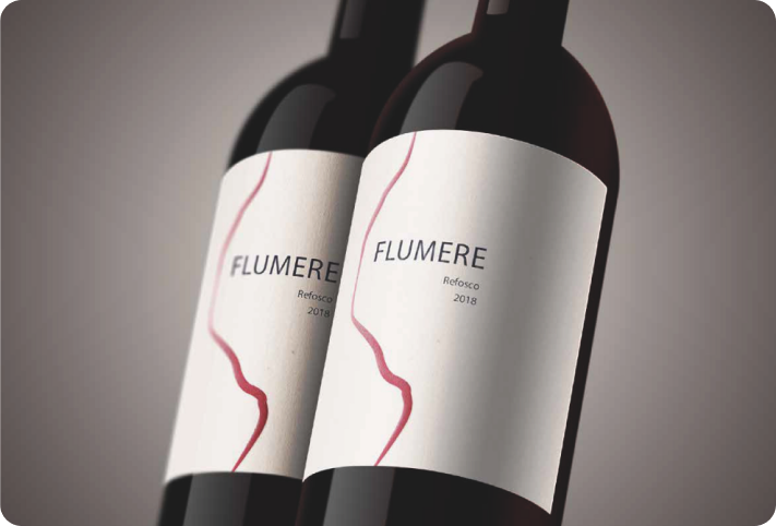
The design of the label represents the stream and, at the same time, a trickle of wine that descends after being poured. Every type of wine is paired with a color that describes its personality.
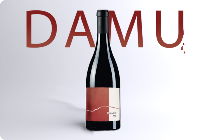
The owners also have a strong connection with South Africa. They decided to dedicate this special blend to that continent. In fact “Damu” means “blood” in Swahili.