BRAND IDENTITY 
A unique location with ancient roots where couples can
find a magical place to spend their love escape.

November 2020
Visual Designer
Domina Service sas
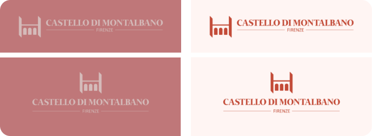
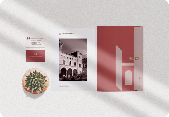
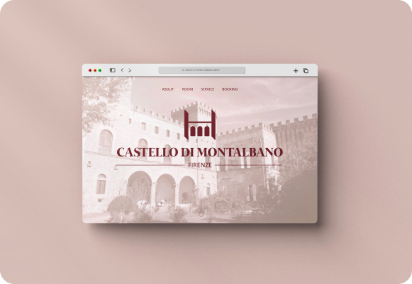
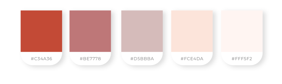
The branding required an ancient but delicate taste to describe not only the history of the place but also the sensations one experiences as its guest. This is the origin of the choice of a serif whose austerity is attenuated by the alternation of pastel and warm colors.
The symbol synthesises the facade of the castle, transforming itself into the “H” of the hotel.

For the logo, I chose the Mermaid Bold typeface. It looks ancient but it is not old and it has its personality. For the geographical indication, on the other hand, I chose to use the Calibri Regular, which is clearer and more aseptic as it is. I used the same font for the rest of the communications.